

2nd Draft: Decisions and Revisions
- Robert Costa
- Apr 11, 2023
- 1 min read

Updated: Apr 14, 2023
After receiving feedback from my peers I have realized that there are some things that I can improve on and fix.
One of the changes I made is making the magazine cover more clear, specifically making the coverlines smaller so that the cover is less busy and packed. I also changed the order of the coverlines as I felt it was too stale beforehand and made the dateline bigger so it was more visible.


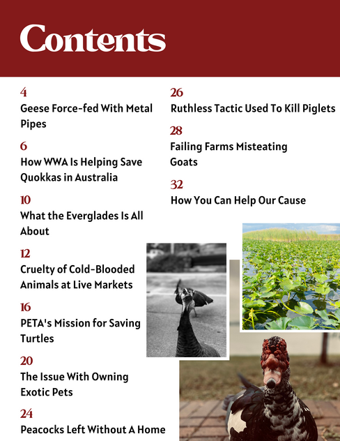
Another change was spending some time making the TOC more dynamic and more fitting of the theme in my DPS. I achieved this by using the same color as the background of my DPS for the font color of Contents, which I also made bigger, and applying that color to graphics added on the page similar to the ones in my DPS. I also added a page number and made the font smaller so it fits the page better.


Additionally, I touched up the writing of my DPS article to make the images used more intentional as they are referenced rather than just pictures that were taken at the Everglades. For this, I also changed the placement of the greenery and alligator pictures. I also made the picture used for the title a little larger so the alligator swimming was more visible, made the author's name black, and played with the opacities and layering of the graphics on the second page, which helps the DPS look more pleasing, as well as added page numbers.


Comments