

Masthead Typography Research
- Robert Costa
- Jan 18, 2023
- 3 min read

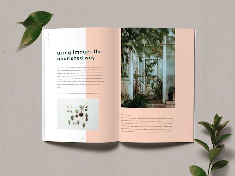
The masthead of a magazine cover is one of the most important things to focus on for your cover. It is what catches the eyes of many readers and is an important factor that helps the audience decide whether they want to read the magazine or not as it is meant to define what the magazine will be about. Thus, the font chosen for the masthead is an important decision to make that must be thought out well as the font helps give the mood of your magazine.

In this masthead, they include a hot pink Serif font. They intentionally place the masthead behind the top of the dog's head to add more dimension and make the dog stand out. They also include some small text that interacts with the masthead as they cut out a heart shape into the top of the d which plays into the text "More bite more heart!". The pink color gives a more light-hearted feel and is more feminine which helps attract their target audience who is most likely women as they also include a cute dog with puppy eyes and are usually more interested in dogs than males. This masthead helps create a strong brand identity as it is very clearly steered toward females and gets the attention of the people who they want to read their magazines effectively.

This masthead is a simple bolded white Serif font. The text has a small amount of shadow to help it pop out from the rest of the page. The white color palette helps keep the magazine audience broad as it doesn't suggest a target audience, therefore, being welcoming to all. The white modernistic look can also be seen as something that is generally appealing to all sorts of people. This creates a strong brand image as it is easy to recognize due to its simplicity as it is also a short masthead that is memorable.

THE GLOBE
I like the feeling that this Sans Serif font gives off as it emphasizes the idea of the animals being in rough situations. I also enjoy the discoloration and boldness of the font which helps reinforce that idea.

XEKOV Atrial
I enjoy this Serif font because of its uniqueness and the energy it brings as it looks like it has animalistic features making it feel more alive with the unique shapes that are reminiscent of fur.

Animal
I like this Sans Serif font because of how different and unique it is and its ability to show how fonts can be fun and imaginative.

Metropolis
I like the simplicity of the Serif font and how it is able to give off a more serious and formal mood that could fit well with the theme of the magazine.

Lemon Milk

Bold Lemon Milk

Bold and Italic Lemon Milk
I like these San Serif fonts because of their modern look and how they are able to fit into a broad amount of themes due to them being more simple. Of these styles, my favorite is Bold Lemon Milk as it has more feeling without being overbearing.

Cavilant
I really enjoy this San Serif font because although it is generally simplistic it has its own twist that brings character to the masthead, with the R especially due to its short legs. It does not give off a too serious or fun mood but instead is a good balance.

Built Titling

Built Titling Sb

Built Titling Bold
This San Serif font is nice and simple yet gives off a sense of urgency at the same time which I enjoy, particularly with the Built Titling Bold.

Mermaid
I like this Serif font because of how it flows and looks aesthetically pleasing while still being more modern and not overdoing any details.

Gilbert Qualifi
This Serif font is very interesting as it has indents that make it more engaging and colorful which I really enjoy and I think fits well with the theme of animals as the font has more life in it.

Ring Netlike
I like the uniqueness of this Serif font as it has interesting letter shapes and thickness which catch people's attention and looks appealing.


These are my favorite top choices because I think they have a lot of character and feeling to them without being too much and can match the feeling that I want my magazine to have. While the first one is more extreme I think if done well it can fit into the cover page without being too distracting and still conveying the mood it is intended to. The second one is simple but gives room for me to experiment with my cover as it is simpler than the others whilst not being boring. I think the last one fits in really well with the concept of animals because of its unique characteristics and indents that give off a nature vibe.


Comments